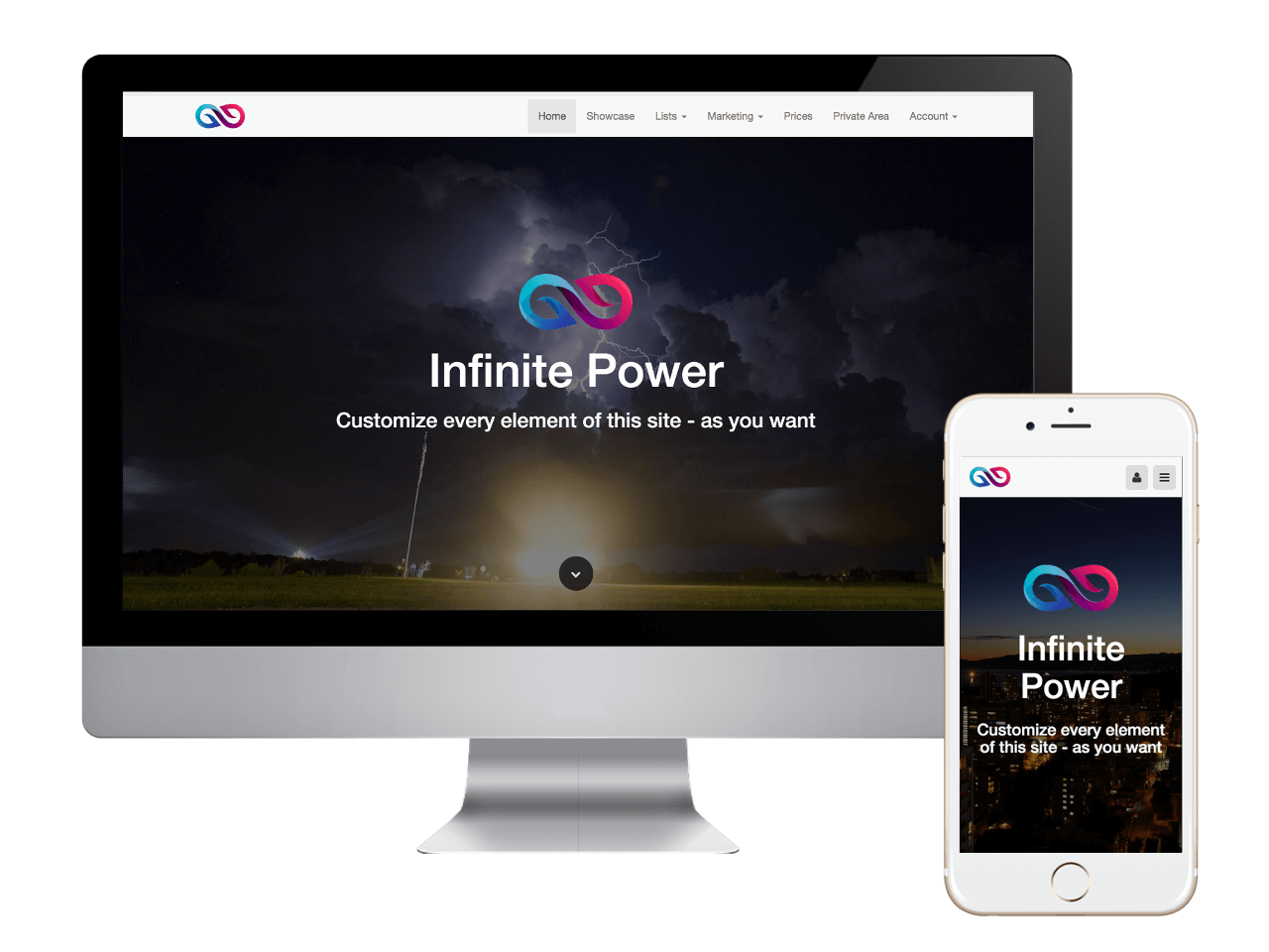
Mobile First Websites
Created To Meet Or Exceed Google's Mobile First Best Practices
The mobile-first approach is exactly as it sounds: designing for the smallest mobile screen and working your way up to tablets, ipads, laptops and desktop computers. Our sites are built with an adaptive design. This basically means that our system has created a website and webpage layout designed for each type of mobile device, tablet and desktop system.
Our system adapts to the screen size of the visitor.
When a search is done, our system recognizes the device as a mobile phone, a tablet or desktop, and presents the perfect website or webpage for that specific device.
In the past, and even today, virtually every system creates a website for the desktop first. Then it 'resizes, or reduces' that page down to fit a mobile device, table or laptop. This resizing slows down the delivery to your visitors, and depending on how slow the site is presented, you could potentially loose a customer.
What You Will Get With Our Mobil First Websites
A Website Built For Mobile Phone First
If your trying to make a first impression with your customers and clients on their mobile phone, you can do it with our mobile first technology websites. Our websites are created specifically for mobile phones first. It doesn't matter if your phone is using Android OS, Bada (Samsung), iPhone OS, MeeGo OS (Nokia and Intel) or any of the other operating systems, when someone does a search for your site, the website presented will fit their phone perfectly, and load extremely fast.
Fast page speed is what your customers and clients demand in todays online world. Our websites will keep your customers from going somewhere else, because they won't have to wait for the webpage to load.
Exceptional User Experience On Tablets
If you are planning on marketing to non-millenials, the tablet is the way to go.
We have taken the same technology that we created for mobile devices and used it to create the best user experience for those that spend a lot of time on their tablets.
It's a fact that both mobile and tablet sales and useage is done in the late evening hours and on weekends. And tablets surpass mobile phones by a large number, and are used for a much longer period of time everyday.
Because of that, we ensure that the user experience for tablets is second to none. Contact us to find out more.
The Indomitable Desktop Computer
Yes, it's true that around 50% of all searches are done on a mobile device or tablet. However, that only accounts for HALF of the online searches worldwide.
What does that mean for you and your customers and clients? The other 50% is being done on laptop and desktop computers. They haven't disappeared like the dinosaurs people say they are. They are still around and being used every single day.
So, while there is such a huge push for mobile page speed, you should never overlook the indomitable desktop or laptop computer. Don't forget to target these people in your marketing plans either!
And we haven't. With our Mobile First technology, we have created the perfect desktop delivery system. Everyone of our desktop sites loads super fast, and are very easy to navigate.
