NEED FOR SPEED - A Shift from Desktops to Mobile Optimized Websites

Just like any other meshwork, Internet too needed only an initiation to get started. And ever since it initiated, it has spread at the fastest possible pace of all time and continues to do so making the world smaller each day. The technical breakthrough transformed the real world into the digital world. And with everything going digital, gadgets are getting smaller. What used to be done on PCs is now being done on smartphones, minicomputers always in everyone’s pocket.
Any marketer has two options; either to adapt to the customer’s choice or create something that can emanate a grand salutation. With an increase in competition in almost everything from service to goods to everything, even the sources and suppliers have increased immensely. Companies started networking over the telecommunication which enabled the consumers to indulge more. With the advent of newcomers every day, their websites need an intelligent place and that can be attained only with the fastest pace on their most customarily and frequently used interface. Web presence is mandatory to lead any kind of market, but to outrun the competition, any website’s capacity and capability is now looked by its inherited speed. Whatever kind of industry a website is catering to, there is only one solution for the speed and that is Mobilefirst.ca. Mobile-friendly websites that are made adaptive to desktops is how any website can mark its web presence remarkably. Today with a mobile phone in every hand and access to the internet and lack of time, if this CLICK does not happen instantly due to any glitch can lead to user’s hitch to another similar site. 52% of customers are put off due to bad mobile experience. Customer needs an instant action or they move on. About 40% of people go to a competitor for the same reason while 61% of people tend to recommend when they have a good mobile experience. “For every 100 milliseconds improvement in search page loading time, eBay saw a 0.5% increase in "Add to Cart" count.” For a marketer to match the user pace in a user-friendly manner, he needs to improve the speed of his appearance in digital space. And today’s digital space is a mobile phone, pretty small device in hands.
Earlier users used the desktop version of websites on the desktops. Integration of internet access with the mobile networks brought a shift of browsing device. The shift took place at such a pace that Google had to carry its experimental surveys by Mobile-first indexing. Desktop sites being complex and heavy due to a large amount of structured markup, took longer to load on a mobile device. To cope up with the speed problem, the same sites launched their mobile versions that could load comparatively faster on mobile phones. And webmasters started changing the site configurations where primary content and markup be in a balanced equation across mobile and desktop. Any site owner can easily and efficiently run the verification of the equivalence of structured markup across desktop and mobile by typing the URLs of both versions into the Structured Data Testing Tool and output compared. With many mobile versions of desktop sites coming up, they started having access to Googlebot and other web crawlers. The major role behind any success is its acceptance and with websites welcoming this method of crawling, in July 2019, mobile-first indexing was announced to become the default for all websites. With the URL inspection tool, last indexing and crawling of any website can be tracked easily. Many site owners who had verified desktop sites in search console started getting their mobile sites designed and verified to meet the need.
But there were two problems. First is the speed and second the difference in amount and quality of content on both versions. This was due to the reason that desktop sites were made responsive to attend the need of any browser using mobile for the same site. But due to lack of certain features, users were inclined to visit the desktop version which was further slow. While paying attention to user-centric performance metrics, speed of the web apps has been found to play a major role in conversion rate, leads or drops. Sites need to be equipped with speed to address the real user’s needs. In any business, what is a limiting factor can be converted to the leading factor. In digital space, this factor has been diagnosed to be the speed. Though device capabilities and network conditions cannot be dealt with by the site owners, they can enhance efficiency at their ends. It’s not just a page load time speed that matters and accounts for a site’s performance but a throughout experience. Any website should be such as to deliver everything right away just on a click regardless of the browser or the device. Whether it’s during reading your profile, browsing your products or making an actual purchase and using a payment gateway, good/bad experience can happen anytime during the navigation till the user screen has your site. 84% of people face difficulty in making transactions through mobile versions of web apps.
Now here comes the solution to attend the Need for Speed.
What, Why and How we do at Mobilefirst.ca?
#1. Mobile optimization: Due to lesser content or features than desktop sites, mobile sites lacked some relevance. Here comes the need for mobile sites to be designed first and then made them adaptive to the desktops. So, this will make your site quick on every click on both mobile as well as desktop. And, this is what we do at Mobilefirst.ca. As evident from the name, our priority is to get your website designed to gain recognition and popularity in the digital world. And to address the need for speed, we first make the mobile site and then make it adaptive for the desktops. A completely functional mobile site makes it a complete mobile-optimized site rather than a broken or an incomplete mobile version of the desktop site. And this is what we do at Mobilefirst.ca. We create mobile-optimized sites that have high speed and can be crawled quickly whether the browsing is being done on a mobile or a PC. It is more likely for a customer to buy your product/service from a quick responsive site because it gives them very less time for comparison across various options across various sites. Lesser the time a customer gets for thinking or comparison; more are the chances of call-to-action and potential conversion. This is the direct involvement of consumer’s purchase behaviour that can persuade or convert prospective buyers into actual consumers.
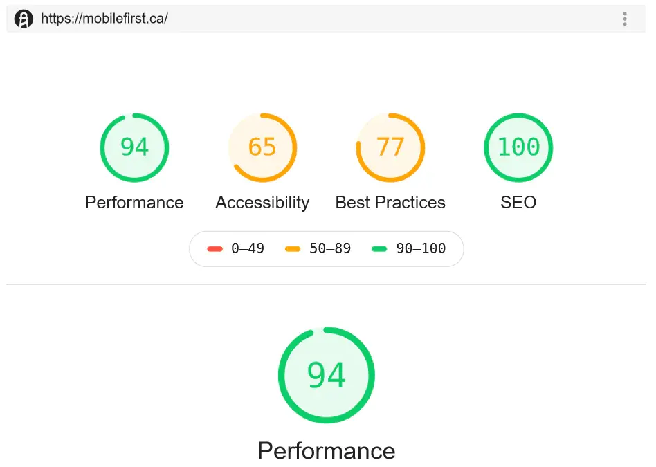
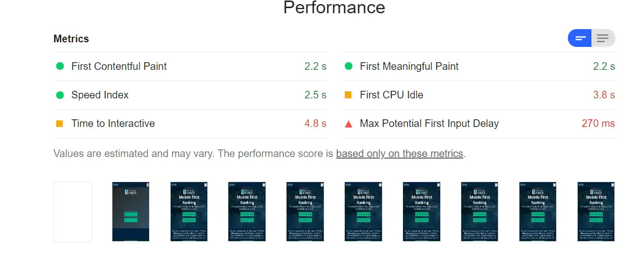
Here is a snapshot of our own website taken with Google Insights:
#2. Need for speed: With many mobile versions of websites now popping up, they lack speed that is becoming the limiting factor for any business and can massively affect the conversion rate. We value the evaluation that recorded a 20% impact on conversion rate with just one-second delay in display.1 Higher the speed, more is the conversion; lesser the speed, more is the drop. To address the need of the user, it is essential to be present within a second, whether on desktop or on mobile. Now, to stay ahead, what these sites need is the speed because even the ranking system considers the site’s speed for Google search and Ads. And this is what we offer at Mobilefirst.ca.
#3. Improving Marketing Performance: The traditional purchase journeys have too many unnecessary time consuming, tiring and sometimes boring steps. At Mobilefirst.ca, we intend to make it shorter and fruitful. And How we do it is by merging technologies with the strategies to make your site the most user-friendly and by keeping them engaged and stay on your site. A customer is less likely to leave a site if it opens just a click away while a 3-second delay can cause a drop. The plus point for the marketers is that they can track down the progress and the success of their marketing campaigns. Creation of product catalogues, automated inventory management, cheap advertisements especially targeting the right audience, getting insights, tracking sales, managing orders, click to buy, click to call, click to message and much more custom options have made both sales and purchase smoother than ever.
Not just the product sites, but internet banking, online auction sites, tickets and reservations all have recognized the importance and necessity for quick render. At Mobilefirst.ca, we take care of all the matters by creation, development and maintenance relevant to your company’s web presence regardless of the browser. Traditionally, it was mail-ordering catalogue shopping which has now modernized and expanded to digital global experience.
#4. Real-user based performance: A real-time user waits for an initiated action only if he knows that rendering is happening. Hence, a visual notification is essential to make him stay. And this is what we do at Mobilefirst.ca. We use Paint timing tool with more usage of First Contentful Paint (FCP) and keeping a check into targeted time to Interactive (TTI). This keeps the user engaged and makes him stay. Every story has a Hero and every site has hero elements. At Mobilefirst.ca, we identify and pop them up to the user in their most pertinent manner.
#5. We are ready for the TEST: Any real user can track your site’s performance. He is equipped with metrics like load and DOM Content Loaded. We at Mobilefirst.ca are ready for the test since we design websites that deliver at the fastest pace and pass the Lighthouse and Web Page Test. And how we do this is by building and creating mobile first website instead of desktop first, employing our specialized speed enhancing techniques. It’s like expecting to get a different result while continuing to build it the same way. We make the qualitative as well as the quantitative choice of the metrics that can enhance or curtail the site speed. Apart from encryption, we make smart choices like that of image optimization (number and sizes of images), the number of web fonts, script sizes, using critical path optimization, predictive prefetching, providing autosuggestions, pre-filled lead forms, devising efficient parsing algorithms and much more. You get them all here at Mobilefirst.ca. Each website is different and has different goals. We customize the sites with an in-depth insight into the goals of the site and expectations of the users. We deliver every user the best web experience with highly performant mobile-friendly websites made adaptive for desktops. This enhances the speed efficiency on both mobile and desktop for the same site. And any site owner can track our built site’s performance even by fetching data from real-users through many new application programming interfaces (API)s like Performance Observer, Performance Entry and DOMHighResTimeStamp.
When 82% of the customers buy your product/service from a mobile, you need to go Mobilefirst.ca because performance matters and Speed is the King. And this is which is why you need to get your website designed on mobile and make it adaptable to the desktop. We are the First and the Best to cater to your site’s needs and empower you with the equipment to cater to the final consumer’s need. We do the incontestable job in a manner that the consumer can get easily associated visually, emotionally and psychologically to you as ‘THE BRAND’ and unshakable connections be established.
References:
- SOASTA, The State of Online Retail Performance, U.S., April 2017
- Google Internal Data, September 2018


To add this web app to your homescreen, click on the "Share" icon

Then click on "Add to Home"
To add this web app to your homescreen, click on the "Share" icon
Then click on "Add to Home"
It looks like your browser doesn't natively support "Add To Homescreen", or you have disabled it (or maybe you have already added this web app to your applications?)
In any case, please check your browser options and information, thanks!
It looks like your browser doesn't natively support "Add To Homescreen", or you have disabled it (or maybe you have already added this web app to your applications?)
In any case, please check your browser options and information, thanks!